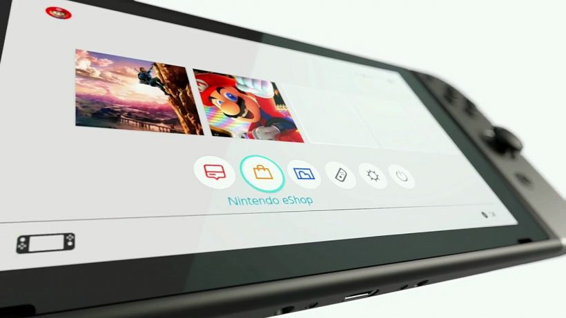
The Nintendo Switch Presentation video has revealed a bit about the Switch’s user interface.
If you were paying attention at around eight minutes into the Nintendo Switch Presentation, you might have noticed that they offered a peek at the system’s user interface – a four second piece of the video showing off most of the main navigation bits. In wanting to get us a better look I’ve slowed the video down approximately 2.5x, giving viewers a more tangible ten second look at the menu.
Check it out below;
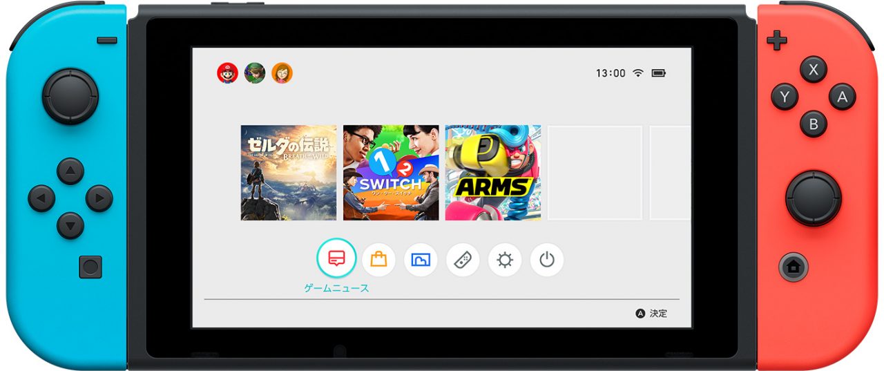
As you can see, there are icons for sleep mode, system settings, controllers, album, and the Nintendo eShop. As for the final icon on the left, it appears to be called game news (ゲームニュース) as the image from the Japanese Nintendo website below serves to illustrate. The tiles above those icons are games installed on the system – with the time, wifi status, and battery remaining shown in the top right. We’re assuming the top left is logged in players, but I don’t believe that’s been confirmed.
Additional details and a full rundown of the UI are likely to hit as some people get hands on with the device and/or Nintendo continues their sharing of new information, but for now we’ve at least got some of the basics down.
What do you think so far?


